Design Grid - Getting Started
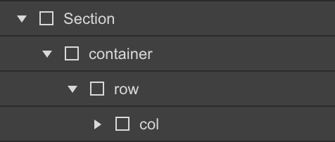
Section → Container → Row → Column
Columns need to be nested within a "row" and a direct child of a "container". All columns start off at equal-widths by defining the class of "col" and auto-collapse at the mobile portrait breakpoint if no responsive classes are defined.
Remove column Gutters
To remove all padding from columns, use the "no-gutters" class preceded by the initial class of "col".

Full-Width Container
Define your div with a class of "container-fluid" for full width.

Responsive Grid
Grid - Desktop
To define our 12 column grid, all classes must precede with the initial class of "col"

Grid - Desktop XL (1280 - 1439px)
Grid - Desktop XXL (1440 - 1919px)
Grid - Tablet (Breakpoint)
Defining our tablet breakpoints, all classes must precede with the class of "col" and if defined, your desktop class of "col-(1-12)"

Grid - Mobile Landscape (Breakpoint)
Defining our tablet breakpoints, all classes must precede with the class of "col" and if defined, your desktop and tablet classes of "col-(1-12)"

Grid - Mobile Portrait (Breakpoint)
Defining our tablet breakpoints, all classes must precede with the class of "col" and if defined, your desktop and tablet classes of "col-(1-12)"

Column Wrapping
If responsive columns are placed within a single row and which the total result in greater then 12, they will automatically wrap onto a new line.
Vertical alignment
Align-Start
To align columns from the top, combine a class of "align-start" preceded by the class of "row"

Align-Center
To align columns from the center, combine a class of "align-center" preceded by the class of "row"

Align-End
To align columns from the bottom, combine a class of "align-end" preceded by the class of "row"

Horizontal alignment
Justify-Start
To align columns from the left, combine a class of "justify-start" preceded by the by class of "row"

Justify-Center
To align columns from the center, combine a class of "justify-center" preceded by the by class of "row"

Justify-End
To align columns from the right, combine a class of "justify-end" preceded by the by class of "row"

Justify-Between
To evenly space columns between each-other, combine a class of "justify-between" preceded by the class of "row"

Justify-Around
To evenly space columns around each-other, combine a class of "justify-around" preceded by the class of "row"

Self-Align Columns
To individually self-align columns, combine a class of "self-start", "self-center", "self-end" preceded by the by class of "col"

Column Reordering
To individually reorder columns, combine a class of either "order-first", "order-last", preceded by the by class of "col"
